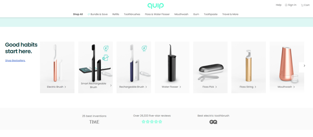
Whitespace, also known as negative space, is the empty space between elements on a webpage. It is an important design element that can help to improve the readability and clarity of a website and create a sense of sophistication and professionalism. Knowing how to use whitespace effectively in website design is a must.
Here are some tips on how to use whitespace effectively in website design:
1. Use Whitespace Effectively to Create Hierarchy.

Image from: playstation.com
Whitespace can be used to create a hierarchy of information on a webpage, with more important elements given more space and less important elements given less space. This helps to guide the user’s eye around the page and draw attention to important information.
2. Use Whitespace Effectively to Improve Readability.

By using whitespace around text and other elements, it can be made easier to read and scan. This is especially important for websites with a lot of written content, as it can help to prevent user fatigue and improve the overall user experience.
3. Use the Whitespace Effectively to Create Balance.

Image from: nekohama.co
You can optimize the visual appeal of a webpage by using whitespace effectively in website design to create balance. By using whitespace to separate different sections of a webpage, it can be visually appealing and help to create a sense of order and prevent the page from feeling cluttered or overwhelming.
4. Use Whitespace Effectively to Enhance the Overall Design.

Image from: julienjoly.com
Using whitespace creatively can enhance the overall design of a website. It can also add interest and visual appeal to a webpage, in addition to its functional benefits.
5. Consider the Overall Layout

Image from: wealthsimple.com/
When designing a website, it is important to consider the overall layout of the page when using whitespace. To create a harmonious design, you should balance the amount of whitespace used with the amount of content on the page.
6. Use Whitespace Effectively to Draw Attention

Image from: breville.com
A website uses whitespaces to separate images and draw attention to specific elements on a webpage. By using whitespace to surround an important element, it can help to make it stand out and grab the user’s attention.
7.Use Whitespace Effectively to Be Consistent.

Image from: shopflowe.com
It’s important to be consistent in the use of whitespace throughout a website to create a cohesive look and feel. Inconsistent use of whitespace can create a disjointed and confusing user experience.
8. Test and Adjust
As with any design element, it’s important to test and adjust the use of whitespace to ensure that it is effective. You can do this by conducting user testing, where you ask a group of users to complete specific tasks on the site and provide feedback.
Whitespace is an important design element that can be used to improve the readability and clarity of a website, create balance, and enhance the overall design. The overall layout, using whitespace to draw attention, and being consistent in its use, should be considered so that businesses can effectively use whitespace to create a professional and user-friendly website.


