
Minimalist website design is a popular trend that involves using clean, simple, and uncluttered design elements to create a sleek and modern look. In this article, we’ll go over ten of the best minimalist website designs, and discuss some key considerations for creating a successful minimalist website.
airbnb
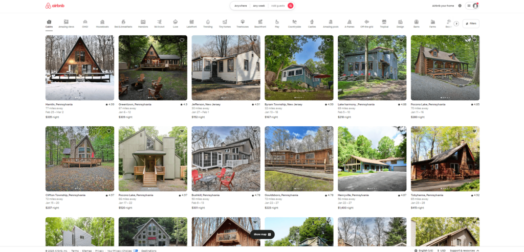
Airbnb’s website is a great example of minimalist design done right. The website uses a clean, white background and simple, sans-serif font, and incorporates large, high-quality photos to showcase the company’s offerings. The website also makes use of negative space and clean lines to create a cohesive, modern look.
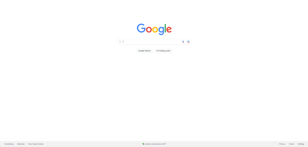
Google’s minimalist design is iconic, and for good reason. The search giant’s website uses a simple, clean layout with a white background and a single, bold, sans-serif font. The website is also highly functional, with a clear and intuitive navigation menu and search bar.
Apple
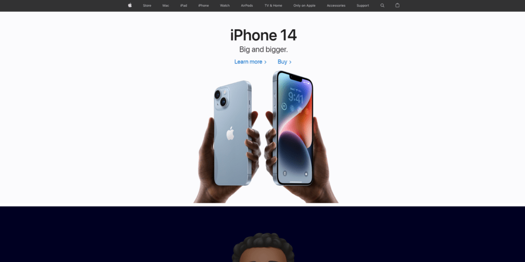
Apple is known for its sleek, minimalistic design, and its website is no exception. The website uses a clean, white background and simple, sans-serif font, and incorporates high-quality product photos and videos to showcase its offerings. The website also makes use of negative space and clean lines to create a cohesive, modern look.
Nike
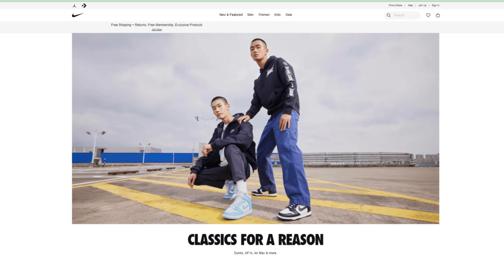
Nike’s website is a great example of how to use minimalism to create a strong, bold brand identity. The website uses a black and white color scheme, with simple, sans-serif font and large, high-quality product photos. The website also makes use of negative space and clean lines to create a cohesive, modern look.
Dropbox
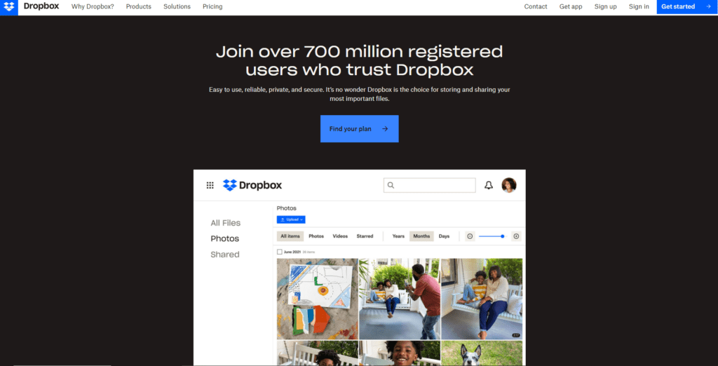
Dropbox’s website is another great example of minimalist design done right. The website uses a clean, white background and simple, sans-serif font, and incorporates large, high-quality photos and graphics to showcase the company’s offerings. The website also makes use of negative space and clean lines to create a cohesive, modern look.
Behance
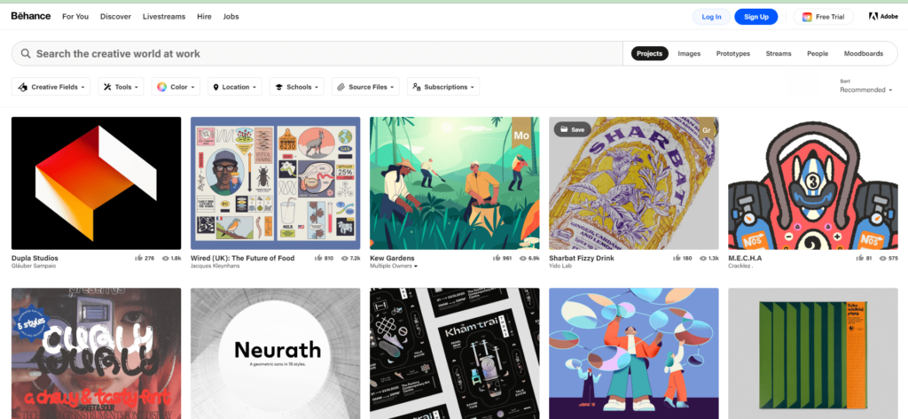
Behance’s website is a great example of how to use minimalism to create a stylish, creative look. The website uses a clean, white background and simple, sans-serif font, and incorporates large, high-quality portfolio pieces to showcase the work of its users. The website also makes use of negative space and clean lines to create a cohesive, modern look.
Squarespace
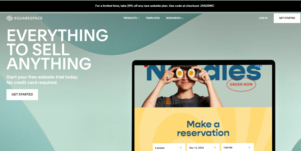
Squarespace’s website is a great example of how to use minimalism to create a professional, sophisticated look. The website uses a clean, white background and simple, sans-serif font, and incorporates large, high-quality photos and graphics to showcase the company’s offerings. The website also makes use of negative space and clean lines to create a cohesive, modern look.
Mailchimp
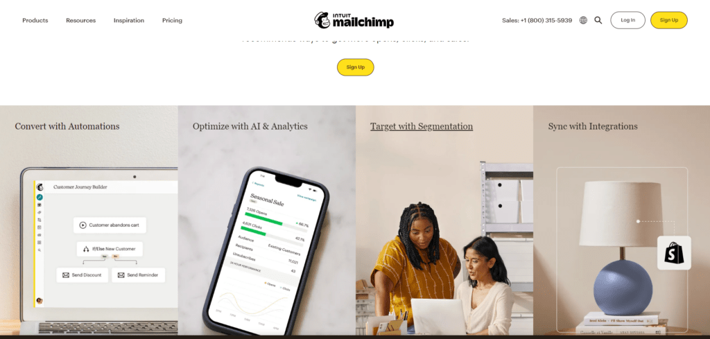
Mailchimp’s website is a great example of how to use minimalism to create a fun, quirky brand identity. The website uses a clean, white background and simple, sans-serif font, and incorporates large, colorful graphics and illustrations to showcase the company’s offerings. The website also makes use of negative space and clean lines to create a cohesive, modern look.
Spotify
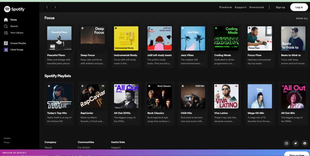
Spotify’s website is a great example of how to use minimalism to create a stylish, music-centric brand identity. The website uses a clean, black and white background and simple sans-serif font. They also incorporate large, high-quality music-themed graphics and photos to showcase the company’s offerings. The website also makes use of negative space and clean lines to create a cohesive, modern look.
Slack
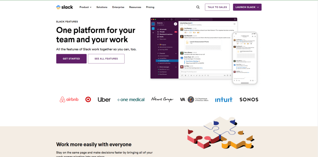
Slack is known for having a minimalist website design. The company’s website is clean and uncluttered, with a focus on simplicity and ease of use. The homepage features a large hero image that showcases the product in action, and the rest of the page is dedicated to explaining the features and benefits of the product. The website uses a limited color palette and simple, sans-serif fonts, and the layout is easy to navigate.


